MyRiskAssessor Dashboard: Precision in Risk Oversight
The MyRiskAssessor Dashboard serves as the nerve center for risk management, delivering an integrated view of pivotal risk insights through meticulously designed pods. Offering real-time risk quantification and year-over-year analysis, the interface elevates data complexity into actionable intelligence.
Navigate seamlessly through Quick Links for instant access to critical functionalities. Assess Risk Ratings and Counts for immediate prioritization and prevalence insights. Engage in in-depth year-over-year examinations to discern evolving trends in risk landscape, control effectiveness, and risk comparison.
Simultaneously, monitor real-time Risk Tracker Stats and Overdue Trackers for proactive risk mitigation. Dedicated pods for Changes, Incidents, and Customer Surveys offer granular perspectives on operational shifts and customer sentiments. The MyRiskAssessor Dashboard isn't just a visual aid; it's a strategic enabler cultivating a proactive risk management culture, providing the technical precision and depth essential for informed decision-making.
Layout
-
The Dashboard is divided into eleven separate pods /section, each showing specific information with useful filtration options.
- Quick Links: displays the quick links for the My Risk Assessor application.
- Risk Rating: displays the risks with risk rating.
- Risk Count: displays the total risks.
- Risk Count YoY: displays the risk count year-over-year.
- Risk Comparison YoY: displays year-over-year comparison of risks.
- Control Effectiveness YoY: displays the control effectiveness year-over-year.
- Risk Tracker Statistics: displays the Risk Tracker Statistics.
- Overdue Tracker: displays the risks that are overdue.
- Change & Incident: displays all changes and incidents.
- Incident Severity/Status: displays incident severity and statuses.
- Change Priority/Status: displays change priority and statuses.
- Customer Satisfaction Survey: displays customer satisfaction survey.
Quick Links
- This pod displays some useful links to the My Risk Assessor application.
- Click the link to navigate to the screen.
-
For reference, see the screen below.

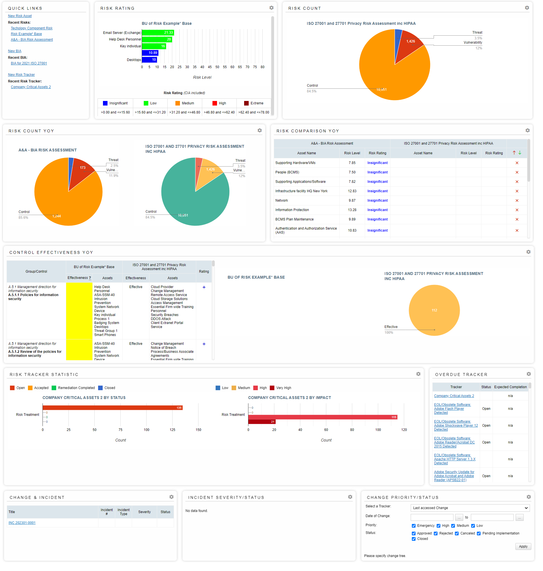
Risk Rating
- This pod displays the assets related to the selected risk and the respective risk level of every asset involved in the selected risk. This allows the users to easily identify the vulnerable assets and their risk score, assisting in easy mitigation later-on.
- The pod also displays the risk legend at the bottom of the pod.
- To view the filtration options, click the settings button.
- Choose the risk by selecting one from the dropdown.
- Choose number of assets to display. To view all assets, choose the Show all option from the drop down.
- To apply the filters, click the Apply button.
-
For reference, see the screen below.
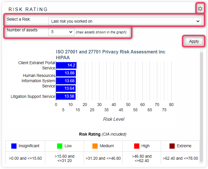
Risk Count
- This pod displays the assets count related to the selected risk. The pie-chart shows the percentage share based on the count of Threats, Vulnerabilities, and Controls for the selected risk. This allows the users to gauge the asset quantum and its bifurcation against a particular risk.
- To view the filtration options, click the settings button.
- Choose the risk by selecting one from the dropdown.
- Check or uncheck the Threats, Vulnerabilities, and Controls options to show/not show the metric in the pie-chart.
- To apply the filters, click the Apply button.
-
For reference, see the screen below.
Risk Count YoY
- This pod displays the year-over-year comparison between the two selected risks based on asset count. Information is shown in pie-charts, showing percentage share based on the count of Threats, Vulnerabilities, and Controls for the selected risk. This allows the users to compare both risks in a visual manner for easy risk assessment against a particular risk.
- To view the filtration options, click the settings button.
- Choose the risk by selecting one from the dropdown.
- Choose the risk to compare by selecting the other risk from the dropdown.
- Select similarity level. Similarity level is used to compare the asset name for the selected risk.
- 100 means exact match.
- Other options are [95,90,85,80].
- Check or uncheck the Threats, Vulnerabilities, and Controls options to show/not show the metric in the pie-chart.
- To apply the filters, click the Apply button.
-
For reference, see the screen below.
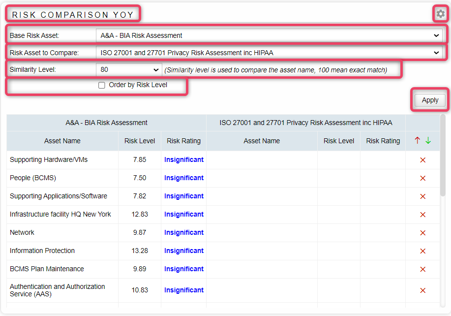
Risk Comparison YoY
- This pod displays the year-over-year comparison between the two selected risks, by showing assets involved in each selected risk. The information is shown in a side-by-side table, that shows Asset Name, Risk Level, and Risk Rating for the selected risk. This allows the users to easily view assets involved in each risk, resulting in an easy risk assessment.
- To view the filtration options, click the settings button.
- Choose the risk by selecting one from the dropdown.
- Choose the risk to compare by selecting the other risk from the dropdown.
- Select similarity level. Similarity level is used to compare the asset name for the selected risk.
- 100 means exact match.
- Other options are [95,90,85,80].
- To sort the results by Risk Level, choose the Order by Risk Level option.
- To apply the filters, click the Apply button.
-
For reference, see the screen below.
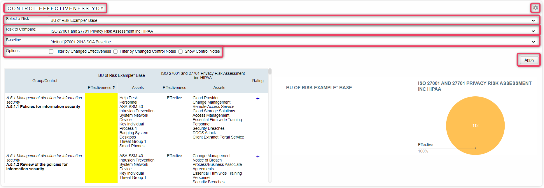
Control Effectiveness YoY
- This pod displays the year-over-year comparison between the two selected risks, in comparison to a baseline risk, by showing effectiveness against each baseline control item. The information is shown in a side-by-side table, that shows Control/Group Name, Effectiveness, and Asset Name for the selected risks. This allows the users to easily view the effectiveness status against each standard group/control.
- To view the filtration options, click the settings button.
- Choose the risk by selecting one from the dropdown.
- Choose the risk to compare by selecting the other risk from the dropdown.
- Choose the risk baseline from the dropdown. The baseline is used as a comparison guide for the two risks selected earlier.
- Check or uncheck the Filter by Change Effectiveness, Filter by Changed Control Notes, and Show Control Notes options to select/unselect the metric in the resulting comparison table and chart.
- To apply the filters, click the Apply button.
-
For reference, see the screen below.
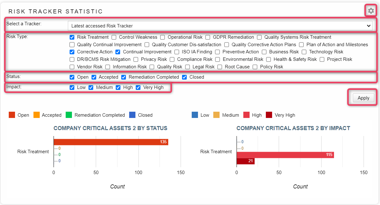
Risk Tracker Statistics
- This pod displays risk tracker statistics and provides multiple filtration options to refine the information. The information is shown as bar charts, each showing critical assets by status and by impact. Filtration option include Tracker Selection, Risk Type, Status and Impact for the selected risks. This allows the users to easily view the effectiveness status against each standard group/control.
- To view the filtration options, click the settings button.
- Choose the tracker by selecting one from the dropdown.
- Check or uncheck the options against Risk Type to filter records accordingly.
- Check or uncheck the options against Status and Impact to filter / reload the charts records accordingly.
- To apply the filters, click the Apply button.
-
For reference, see the screen below.
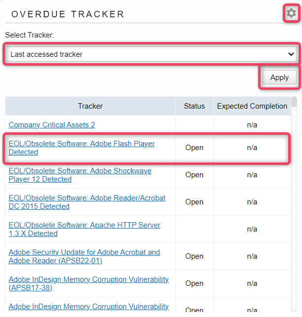
Overdue Tracker
- This pod displays all the trackers that are still open and have not been completed in the due-time. The information is shown in a listing where the selected tracker is clickable and can be selected to view further information.
- To view the filtration options, click the settings button.
- Choose the tracker by selecting one from the dropdown.
- Choose the risk to compare by selecting the other risk from the dropdown.
- To apply the filters, click the Apply button.
-
For reference, see the screen below.
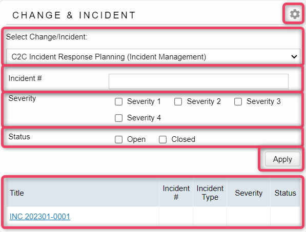
Change and Incident
-
This pod displays incidents and changes and provides filtration options to refine the result set. The information is shown in a listing where the selected change/incident is clickable and can be selected to view further information.
-
To view the filtration options, click the settings button.
- Choose the change/incident by selecting one from the dropdown.
- If incident number is known, records can be filtered by exact incident number in the Incident # field.
- Check or uncheck the Severity and Status options to filter records accordingly.
- To apply the filters, click the Apply button.
-
For reference, see the screen below.
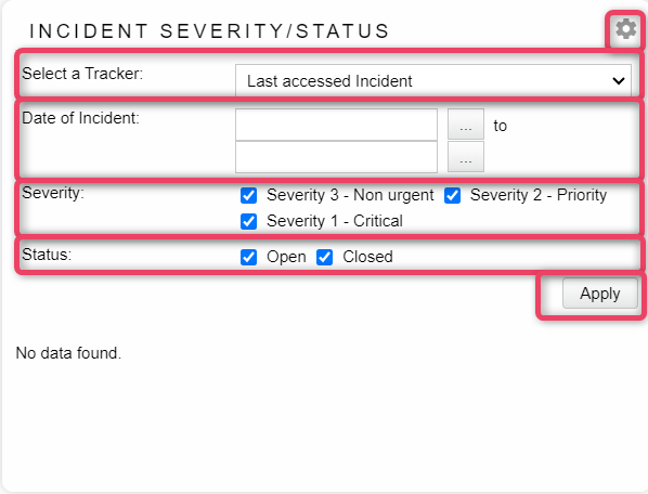
Incident Severity/Status
- This pod displays the incident severity information and provides filtration options to refine the result set. The information is shown in a listing where the selected incident is clickable and can be selected to view further information.
- To view the filtration options, click the settings button.
- Choose the tracker by selecting one from the dropdown.
- Choose appropriate dates to filter the records.
- To search all records, leave dates blank
- Check or uncheck the Severity and Status options to filter records accordingly.
- To apply the filters, click the Apply button.
-
For reference, see the screen below.
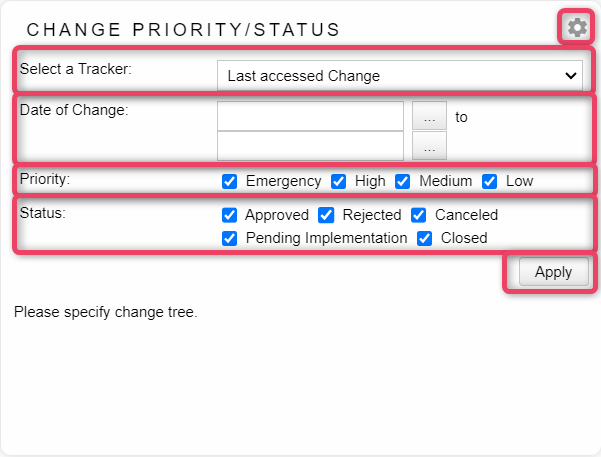
Change Priority/Status
- This pod displays the change priority information and provides filtration options to refine the result set. The information is shown in a listing where the selected change is clickable and can be selected to view further information.
- To view the filtration options, click the settings button.
- Choose the tracker by selecting one from the dropdown.
- Choose appropriate dates to filter the records.
- To search all records, leave dates blank
- Check or uncheck the Priority and Status options to filter records accordingly.
- To apply the filters, click the Apply button.
-
For reference, see the screen below.
 My Assets
 Import Assets
 Open Threat Library
 New Threat Library